


If you’re a DSLR user, you’ll already know all about white balance – but for the uninitiated, here’s a quick definition:
White balance (WB) is the process of removing unrealistic color casts, so that objects which appear white in person are rendered white in your photo. Proper camera white balance has to take into account the “color temperature” of a light source, which refers to the relative warmth or coolness of white light. – source
In the world of iPhoneography and especially Instagram, white balance and colour tone have a big, if somewhat subtle, role to play in developing your visual style. Unlike on a DSLR, you can’t easily change the white balance of a picture before shooting, which means we’ll just be talking post-production here. As ever, I recommend VSCO for this – because it is both my favourite, and also the best ?.
The importance of matching

On Instagram, we’re generally tuned in to a less naturalistic style of editing, which means finding the true or ‘realistic’ white-balance is not necessarily as important as in traditional photography. In fact, there’s an argument to say that unnatural edits actually do better on Instagram.
Instead, the aim is simply keeping to a consistent tone throughout your IG gallery, in order to maintain a coherent & unified visual style.
If your images don’t have a great deal of plain white space in them, it can be easy to miss the subtle differences – it pays to train your eye to spot the underlying colours in your shots, and how these work together. When they don’t match, they don’t flow together, and it becomes hard to pin down your visual style. Do you prefer warm or cool? Bright or muted? Make a decision, and work to keep to it.
If you find this tricky at first, try lining images up side-by-side in your VSCOcam library, so you can compare and contrast. Identify which colour is the underlying tone in your image, and use the relevent tool to dial it up or down to match your previous posts.
A quick tutorial

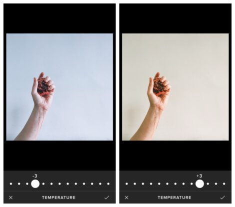
Temperature (the thermometre tool) – This control dials from cold (blue) to warm (yellow). This is especially helpful for correcting an unusually warm photo, either from some artificial light, or simply a sunny day.


Tint (the pipette tool) – This ranges from green-toned to purplish. Often just increasing or decreasing the tone by one point is enough.


Presets (the paintbrush tool) – Some presets add a lot of colour tone, but you can often override this with the above settings. Don’t assume that a preset range will share the same tones throughout – though many do harmonise, they often include a range of different temperatures that can throw a spanner into your carefully worked gallery.
While you’re figuring it out you might find you need to flip between the presets and the editing tools, out to the library view, then back in to editing while you get it just so. Like most things, it seems faffy and labour-intensive at first, but becomes quicker and easier the more you play around – these days, I know my tones for Instagram on sight.
Thoughts? Are you obsessed with your whites, or does this all sound like way too much trouble? I’d love to hear your opinion! x
Ps If you’d like some more in-depth 1:1 Instagram help, take a look at my Instagram course here.
Hashtags for Instagram
Every month, I gather up a selection of winning hashtags and send them straight to your inbox, for free.
Sign up to receive my newsletters every month.


9 Comments
Leave a Comment
Wedding Biz Academy
April 13, 2017
Yaaassss! I am obsessed with ‘white’ at the moment. My frustration is editing images on my iMac, uploading them to my cloud (which I chose as it doesn’t do anything to my image files to affect them), then uploading them to IG only to find they don’t look anywhere near as white as I wanted or thought they did! Yes I can use the IG filter which does the job – but I feel like I am cheating by doing that & that I should be able to edit my images in Lightroom better.
Sarah
January 29, 2016
Many thanks for all your tips – I am trying to get going with my phone camera, and am going to try VSCO, we are off for a week in Scotland (daughter+2 dogs) and am hoping to spend time really learning what I’m doing – am going through your 7 days e-course again!
Kat Terek
January 28, 2016
Orla, I think that’s awesome. When I go out shooting, I do photos so that I can edit them exactly the way I want. If you can predict how things look like, you’re closer to use it to your advantage and making your photography fully represent your vision!
Phillipa
January 27, 2016
This is so helpful thank you! Ps I’ve tried to comment so many times and disqus has just hated me! I think I’ve finally sorted it out!
keishua
January 27, 2016
it is definitely much easier to control on a dslr. my problem is that sometimes the photo feels too washed out and then I find myself obsessing about how to warm it up. definitely appreciate white balance but also into dreamy with lots of good tones these days. I think I might just be rebelling.
Sara Tasker
January 26, 2016
Argh I hate that! I’ve reached a point where I can predict how things will look with my usual post production, so know when I haven’t got the light right… Not sure if that’s good or not! Haha! x
Sara Tasker
January 26, 2016
Who, me? 😉 x
saspetherick
January 25, 2016
genius!
Marie Conan
January 25, 2016
Yes! I am obsessed with white balance and colour tone too! sometimes i won’t post a picture because not matter the amount of tweaking, I just can’t get it right…